Flutter Layout Basics - Stack Overlay Layout#
Overlay layout is suitable for situations where child views are stacked together, and their positions can be determined relative to the boundaries of the parent view.
For example, it can be used to add text over an image, or to add a gradient shadow over a button, etc.
The Stack Widget's child views can either be positioned or non-positioned. Positioned child views refer to those wrapped in a Positioned widget, which confirm their positions relative to the Stack by setting the top, bottom, left, and right properties, with at least one of them not being null.
The size of the Stack Widget depends on all non-positioned child views. The positions of non-positioned child views are determined by the alignment property (when alignment is left-to-right, child views start from the top left corner; when alignment is right-to-left, child views start from the top right corner).
Basic Usage of Stack#
Common Properties of Stack#
- Common properties of Stack
- children: Child views
- alignment: Alignment of child views
- topLeft: Top left aligned
- topCenter: Top center aligned
- topRight: Top right aligned
- centerLeft: Center left aligned
- center: Center aligned
- centerRight: Center right aligned
- bottomLeft: Bottom left aligned
- bottomCenter: Bottom center aligned
- bottomRight: Bottom right aligned
- clipBehavior, clipping, which may affect performance
- Clip.hardEdge: This option is the default for Stack
- Clip.antiAlias: Smooth clipping
- Clip.antiAliasWithSaveLayer
- Clip.none: No clipping needed
- fit: Child view filling method
- StackFit.loose: Uses the size of child components
- StackFit.expand: Fills the area of the parent view
- StackFit.passthrough: Pass-through, uses the layout method of the Stack's parent view
- textDirection
- TextDirection.ltr
- TextDirection.rtl
Common properties of Positioned are as follows:
- Common properties of Positioned
- child
- height
- width
- bottom
- left
- right
- top
Alignment#
The code is as follows:
class MyApp extends StatelessWidget {
  @override
  Widget build(BuildContext context) {
    var stack = new Stack(
      alignment: Alignment.bottomRight,
      children: [
        new Container(
          width: 300.0,
          height: 300.0,
          color: Colors.orange,
        ),
        new Container(
          width: 200.0,
          height: 200.0,
          color: Colors.green,
        ),
        new Text(
          'alignment bottomRight',
          style: TextStyle(color: Colors.white, fontSize: 21),
        )
      ],
    );

    return MaterialApp(
      title: 'StackView Widget',
      home: Scaffold(
        appBar: new AppBar(
          title: new Text('StackView Widget'),
        ),
        body: Center(
          child: stack,
        ),
      ),
    );
  }
}
The effect is as follows:

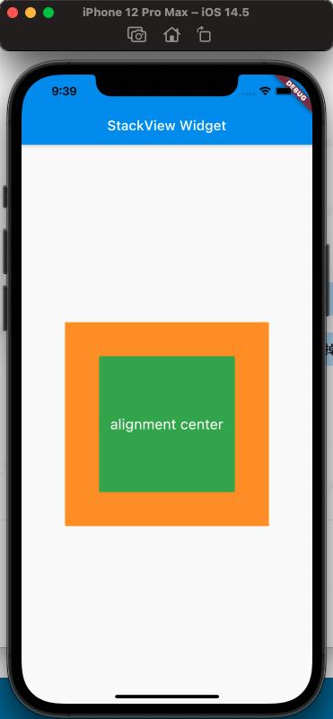

From the comparison above, it can be seen that the alignment property affects the arrangement of the Stack's child views.
clipBehavior Property#
To conveniently observe the effect of clipBehavior, a child view that exceeds the Stack needs to be written using the Positioned Widget, setting top and left to negative values.
The code is as follows:
class MyApp extends StatelessWidget {
  @override
  Widget build(BuildContext context) {
    var stack = new Stack(
      clipBehavior: Clip.antiAliasWithSaveLayer,
      children: [
        new Container(
          width: 300.0,
          height: 300.0,
          color: Colors.orange,
        ),
        Positioned(
            child: new Container(
              width: 200.0,
              height: 200.0,
              color: Colors.green,
            ),
            left: -20,
            top: -20),
        new Text(
          'clip antiAliasWithSaveLayer',
          style: TextStyle(color: Colors.white, fontSize: 21),
        ),
      ],
    );

    return MaterialApp(
      title: 'StackView Widget',
      home: Scaffold(
        appBar: new AppBar(
          title: new Text('StackView Widget'),
        ),
        body: Center(
          child: stack,
        ),
      ),
    );
  }
}
The effect is as follows:


From the above, the effect of clipBehavior can be observed.
fit Property#
The filling method of fit, the expand and loose properties of fit are easy to distinguish, but the difference between loose and passthrough properties needs special attention. To easily distinguish them, here Row is used as the parent view of Stack.
Simply put, expand fills the parent view; loose follows the size of the child view; passthrough follows the constraints of the parent view's parent view.
The code is as follows:
class MyApp extends StatelessWidget {
  @override
  Widget build(BuildContext context) {
    var stack = new Stack(
      // alignment: Alignment.bottomRight,
      fit: StackFit.passthrough,
      children: [
        new Container(
          width: 300.0,
          height: 300.0,
          color: Colors.orange,
        ),
        new Container(
          width: 200.0,
          height: 200.0,
          color: Colors.green,
        ),
        new Text(
          'StackFit passthrough',
          style: TextStyle(color: Colors.white, fontSize: 21),
        ),
      ],
    );

    return MaterialApp(
      title: 'StackView Widget',
      home: Scaffold(
        appBar: new AppBar(
          title: new Text('StackView Widget'),
        ),
        body: Center(
          child: Row(
            children: [Expanded(child: stack)],
          ),
        ),
      ),
    );
  }
}
The effect is as follows:


From the above, it can be seen that when StackFit is set to passthrough, it uses the layout of Row's Expand; when StackFit is set to loose, it uses the layout of child views; when StackFit is set to expand, it uses the layout of Stack.
Using Stack to Achieve Gradient Background Effect#
The code is as follows:
class MyApp extends StatelessWidget {
  @override
  Widget build(BuildContext context) {
    var stack = SizedBox(
      width: 250,
      height: 250,
      child: Stack(
        children: [
          Container(
            width: 250,
            height: 250,
            color: Colors.orange,
          ),
          Container(
              padding: const EdgeInsets.all(5.0),
              alignment: Alignment.center,
              decoration: BoxDecoration(
                  gradient: LinearGradient(
                colors: [
                  Colors.black.withAlpha(0),
                  Colors.black12,
                  Colors.black45,
                ],
                begin: Alignment.topCenter,
                end: Alignment.bottomCenter,
              )),
              child: const Text('Foreground Text',
                  style: TextStyle(color: Colors.white, fontSize: 20.0))),
        ],
      ),
    );

    return MaterialApp(
      title: 'StackView Widget',
      home: Scaffold(
        appBar: new AppBar(
          title: new Text('StackView Widget'),
        ),
        body: Center(
          child: stack,
        ),
      ),
    );
  }
}
The effect is as follows:

References#
Stack Dev Doc
Positioned Dev Doc
StackFit Dev Doc
Flutter Free Video Season 3 - Layout