Step-by-Step Guide to Creating Widget2#
Following the previous article on iOS Widget, this article introduces the usage of WidgetBundle and how to create a widget similar to Alipay. In the previous article, I mistakenly referred to WidgetBundle as WidgetGroup.
Usage of WidgetBundle#
Let's review when to use WidgetBundle. The previous article introduced supportedFamilies, which allows you to set different sizes for the widget, such as Small, Medium, Large, etc. However, if you want multiple widgets of the same size, for example, two Small sized widgets, similar to the effect of the Dongfang Caifu widget below, you need to use WidgetBundle to set multiple Widgets.


Using WidgetBundle is not difficult. Let's take a look at the last code from the previous article (you can download it from https://github.com/mokong/WidgetAllInOne, open Tutorial2), which only displayed one Medium sized widget. Here we will modify it to use WidgetBundle to display two Medium sized widgets.
Create a new SwiftUIView named WidgetBundleDemo, with the following steps:
- Import WidgetKit
- Change the main entry to WidgetBundleDemo
- Change the WidgetBundleDemo type to WidgetBundle
- Change the body type to Widget
The code is as follows:
import SwiftUI
import WidgetKit

@main
struct WidgetBundleDemo: WidgetBundle {
    @WidgetBundleBuilder
    var body: some Widget {
        DemoWidget()
        DemoWidget()
    }
}
Then compile and run, it fails with the error xxx... error: 'main' attribute can only apply to one type in a module, which means that there can only be one @main marking the program entry in a module. Therefore, you need to remove the extra @main. Where is it? In DemoWidget.swift, because the previous main entry was DemoWidget, and now the main entry is the newly created WidgetBundleDemo, so you need to remove @main from DemoWidget. After removing it, run again to check the effect, and find that two identical Medium sized widgets appear in the widget preview.
Wait, as mentioned in the previous article, when swiping left and right on different widgets, the title and description above will also slide along. Why doesn't it slide here?
Indeed, it should be because the title and content are the same. Let's verify this. First, add title and description properties in DemoWidget as follows:
struct DemoWidget: Widget {
    let kind: String = "DemoWidget"

    var title: String = "My Widget"
    var desc: String = "This is an example widget."

    var body: some WidgetConfiguration {
        StaticConfiguration(kind: kind, provider: Provider()) { entry in
            DemoWidgetEntryView(entry: entry)
        }
        .configurationDisplayName(title) // Controls the display of Title in the Widget preview
        .description(desc) // Controls the display of Desc in the Widget preview
        .supportedFamilies([WidgetFamily.systemMedium])
    }
}
Then modify the places where DemoWidget is referenced, that is, in the WidgetBundleDemo class, passing different titles and descriptions as follows:
import SwiftUI
import WidgetKit

@main
struct WidgetBundleDemo: WidgetBundle {
    @WidgetBundleBuilder
    var body: some Widget {
        DemoWidget(title: "Sync Assistant", desc: "This is the QQ Sync Assistant Widget")
        DemoWidget(title: "Alipay", desc: "This is the Alipay Widget")
    }
}
Run again and check the effect, and you will find that the title and description also move, as shown below:

Isn't it simple? The usage of WidgetBundle is as shown above, but it should be noted that WidgetBundle contains only Widgets, and each Widget has its own Entry and Provider, that is, each Widget in WidgetBundle needs to implement methods and content similar to DemoWidget.
Creating an Alipay Widget Component#
Next, let's implement the effect of the Alipay small component as follows:


UI Implementation#
Starting from the first image, let's break down the structure into two views: the left view is for the calendar + weather, and the right view contains 4 functional entry points. The overall size is medium, and then let's implement it:
The code for the left view is as follows:
Next, let's look at the 4 functional entry points on the right side. Before creating the entry points, let's consider what fields this item should have. It needs to display an image and a title, and it should have a link for redirection when clicked. Additionally, SwiftUI's forEach traversal requires an id.
Next, let's look at the Alipay widget. Long press -> Edit Widget -> Select Function, and you can see all the selectable functions. Therefore, we need to define a type to enumerate all the functions. Here, we will use 8 as an example. The resource files are placed in the AlipayWidgetImages folder.
So the overall definition of a single item corresponding to the functional entry is as follows:
import Foundation

public enum ButtonType: String {
    case Scan = "Scan"
    case pay = "Payment"
    case healthCode = "Health Code"
    case travelCode = "Travel Card"
    case trip = "Travel"
    case stuck = "Card Package"
    case memberpoints = "Member Points"
    case yuebao = "Yu'ebao"
}

extension ButtonType: Identifiable {
    public var id: String {
        return rawValue
    }

    public var displayName: String {
        return rawValue
    }

    public var urlStr: String {
        let imageUrl: (image: String, url: String) = imageAndUrl(from: self)
        return imageUrl.url
    }

    public var imageName: String {
        let imageUrl: (image: String, url: String) = imageAndUrl(from: self)
        return imageUrl.image
    }

    /// return (image, url)
    func imageAndUrl(from type: ButtonType) -> (String, String) {
        switch self {
        case .Scan:
            return ("widget_scan", "https://www.baidu.com/")
        case .pay:
            return ("widget_pay", "https://www.baidu.com/")
        case .healthCode:
            return ("widget_healthCode", "https://www.baidu.com/")
        case .travelCode:
            return ("widget_travelCode", "https://www.baidu.com/")
        case .trip:
            return ("widget_trip", "https://www.baidu.com/")
        case .stuck:
            return ("widget_stuck", "https://www.baidu.com/")
        case .memberpoints:
            return ("widget_memberpoints", "https://www.baidu.com/")
        case .yuebao:
            return ("widget_yuebao", "https://www.baidu.com/")
        }
    }
}

struct AlipayWidgetButtonItem {
    var title: String
    var imageName: String
    var urlStr: String
    var id: String {
        return title
    }

    static func generateWidgetBtnItem(from originalItem: AlipayWidgetButtonItem) -> AlipayWidgetButtonItem {
        let newItem = AlipayWidgetButtonItem(title: originalItem.title,
                                             imageName: originalItem.imageName,
                                             urlStr: originalItem.urlStr)
        return newItem
    }
}
Next, let's look at the implementation of the button group on the right side. Create AlipayWidgetGroupButtons.swift to encapsulate the view displaying the 4 buttons, with the following code:
import SwiftUI

struct AlipayWidgetGroupButtons: View {
    var buttonList: [[AlipayWidgetButtonItem]]

    var body: some View {
        VStack() {
            ForEach(0..<buttonList.count, id: \.self) { index in
                HStack {
                    ForEach(buttonList[index], id: \.id) { buttonItem in
                        AlipayWidgetButton(buttonItem: buttonItem)
                    }
                }
            }
        }
    }
}
Then create the left view, which is divided into three parts: weather, date, and a prompt bar, with the prompt bar encapsulated separately. The code is as follows:
Prompt bar view:
import SwiftUI

struct AlipayWidgetLunarView: View {
    var body: some View {
        ZStack(alignment: .leading) {

            ZStack {
                AliPayLunarSubview()
                    .hidden()
            }
            .background(.white)
            .opacity(0.27)
            .cornerRadius(2.0)

            AliPayLunarSubview()
        }
    }
}

struct AliPayLunarSubview: View {
    var body: some View {
        HStack {
            Image("alipay")
                .resizable()
                .frame(width: 16.0, height: 16.0)
                .padding(EdgeInsets(top: 0, leading: 5, bottom: 0, trailing: 0))

            Text("Alipay")
                .font(Font.custom("Montserrat-Bold", size: 13.0))
                .minimumScaleFactor(0.5)
                .foregroundColor(.white)
                .padding(EdgeInsets(top: 4.0, leading: -7.0, bottom: 4.0, trailing: 0.0))

            Text("Today's Favorable")
                .font(Font.system(size: 10.0))
                .minimumScaleFactor(0.5)
                .foregroundColor(.white)
                .padding(EdgeInsets(top: 0.0, leading: -5.0, bottom: 0.0, trailing: 0.0))

            Image("right_Arrow")
                .resizable()
                .frame(width: 10, height: 10)
                .padding(EdgeInsets(top: 0.0, leading: -7.0, bottom: 0.0, trailing: 5.0))
        }
    }
}
The overall left view:
import SwiftUI

struct AlipayWidgetWeatherDateView: View {
    var body: some View {
        VStack(alignment: .leading) {
            Spacer()

            Text("Cloudy 28℃")
                .font(.title)
                .foregroundColor(.white)
                .fontWeight(.semibold)
                .minimumScaleFactor(0.5)
                .padding(EdgeInsets(top: 0.0, leading: 0.0, bottom: 4.0, trailing: 0.0))

            Text("06/09 Thursday Shanghai")
                .lineLimit(1)
                .font(.body)
                .foregroundColor(.white)
                .minimumScaleFactor(0.5)
                .padding(EdgeInsets(top: 0.0, leading: 0.0, bottom: 4.0, trailing: 0.0))

            AlipayWidgetLunarView()

            Spacer()
        }
    }
}
Finally, combine the left view and the right button group, with the following code:
struct AlipayWidgetMeidumView: View {
    @ObservedObject var mediumItem: AliPayWidgetMediumItem

    var body: some View {
        ZStack {
            // Background image
            Image("widget_background_test")
                .resizable()
            HStack {
                AlipayWidgetWeatherDateView()

                Spacer()

                AlipayWidgetGroupButtons(buttonList: mediumItem.dataButtonList())
            }
            .padding()
        }
    }
}
The defined AliPayWidgetMediumItem is similar to a VM, converting the model into the data output needed for the view, with the following code:
class AliPayWidgetMediumItem: ObservableObject {
    @Published private var groupButtons: [[AlipayWidgetButtonItem]] = [[]]

    init() {
        self.groupButtons = AliPayWidgetMediumItem.createMeidumWidgetGroupButtons()
    }

    init(with widgetGroupButtons: [AlipayWidgetButtonItem]?) {
        guard let items = widgetGroupButtons else {
            self.groupButtons = AliPayWidgetMediumItem.createMeidumWidgetGroupButtons()
            return
        }

        var list: [[AlipayWidgetButtonItem]] = [[]]
        var rowList: [AlipayWidgetButtonItem] = []
        for i in 0..<items.count {
            let originalItem = items[i]
            let newItem = AlipayWidgetButtonItem.generateWidgetBtnItem(from: originalItem)
            if i != 0 && i % 2 == 0 {
                list.append(rowList)
                rowList = []
            }
            rowList.append(newItem)
        }

        if rowList.count > 0 {
            list.append(rowList)
        }
        self.groupButtons = list
    }

    private static func createMeidumWidgetGroupButtons() -> [[AlipayWidgetButtonItem]] {
        let scanType = ButtonType.Scan
        let scanItem = AlipayWidgetButtonItem(title: scanType.rawValue,
                                              imageName: scanType.imageName,
                                              urlStr: scanType.urlStr)

        let payType = ButtonType.pay
        let payItem = AlipayWidgetButtonItem(title: payType.rawValue,
                                             imageName: payType.imageName,
                                             urlStr: payType.urlStr)

        let healthCodeType = ButtonType.healthCode
        let healthCodeItem = AlipayWidgetButtonItem(title: healthCodeType.rawValue,
                                                    imageName: healthCodeType.imageName,
                                                    urlStr: healthCodeType.urlStr)

        let travelCodeType = ButtonType.travelCode
        let travelCodeItem = AlipayWidgetButtonItem(title: travelCodeType.rawValue,
                                                    imageName: travelCodeType.imageName,
                                                    urlStr: travelCodeType.urlStr)
        return [[scanItem, payItem], [healthCodeItem, travelCodeItem]]
    }

    func dataButtonList() -> [[AlipayWidgetButtonItem]] {
        return groupButtons
    }
}
Next, create the entry and Provider, with the following code:
import WidgetKit
import SwiftUI

struct AlipayWidgetProvider: TimelineProvider {
    typealias Entry = AlipayWidgetEntry

    func placeholder(in context: Context) -> AlipayWidgetEntry {
        AlipayWidgetEntry(date: Date())
    }

    func getSnapshot(in context: Context, completion: @escaping (AlipayWidgetEntry) -> Void) {
        let entry = AlipayWidgetEntry(date: Date())
        completion(entry)
    }

    func getTimeline(in context: Context, completion: @escaping (Timeline<AlipayWidgetEntry>) -> Void) {
        let entry = AlipayWidgetEntry(date: Date())
        // refresh the data every two hours
        let expireDate = Calendar.current.date(byAdding: .hour, value: 2, to: Date()) ?? Date()
        let timeline = Timeline(entries: [entry], policy: .after(expireDate))
        completion(timeline)
    }
}

struct AlipayWidgetEntry: TimelineEntry {
    let date: Date


}

struct AlipayWidgetEntryView: View {
    var entry: AlipayWidgetProvider.Entry
    let mediumItem = AliPayWidgetMediumItem()

    var body: some View {
        AlipayWidgetMeidumView(mediumItem: mediumItem)
    }
}

struct AlipayWidget: Widget {
    let kind: String = "AlipayWidget"

    var title: String = "Alipay Widget"
    var desc: String = "Description of Alipay Widget"

    var body: some WidgetConfiguration {
        StaticConfiguration(kind: kind, provider: AlipayWidgetProvider()) { entry in
            AlipayWidgetEntryView(entry: entry)
        }
        .configurationDisplayName(title)
        .description(desc)
        .supportedFamilies([.systemMedium])
    }
}
Finally, use it in the WidgetBundle as follows:
import SwiftUI
import WidgetKit

@main
struct WidgetBundleDemo: WidgetBundle {
    @WidgetBundleBuilder
    var body: some Widget {
        AlipayWidget(title: "Alipay", desc: "This is the Alipay Widget")
    }
}
The final display effect is as follows:

Using Widget Intent#
Static Intent Configuration#
Continuing from the above, comparing with the Alipay widget, you can see that the Alipay widget shows an Edit Widget entry when long-pressed, while the one implemented above does not. Let's see how to implement this display.
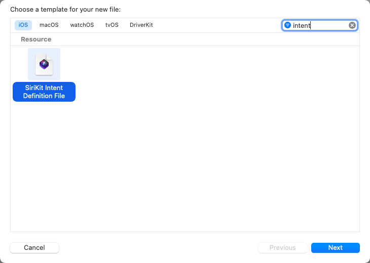
The appearance of the Edit Widget entry requires creating an Intent. Then CMD+N to create a new one, search for intent, as shown in the figure, and click next.
Then enter the name. Note that both the main target and the widget target must be checked, and click Create.
Open the newly created WidgetIntents, which is currently blank. Click the + in the lower left corner, as shown in the figure.

You can see that there are 4 buttons to choose from: New Intent, Customize System Intent, New Enum, and New Type. Here, select New Intent.
Ps: Among the several entries,
Customize System Intentis not commonly used,New Intentis almost mandatory;New Enumcreates a new enumeration, and the name of this enumeration cannot be the same as the enumeration name in the code, so it needs to be converted when used;New Typecreates a class, which will be demonstrated later.
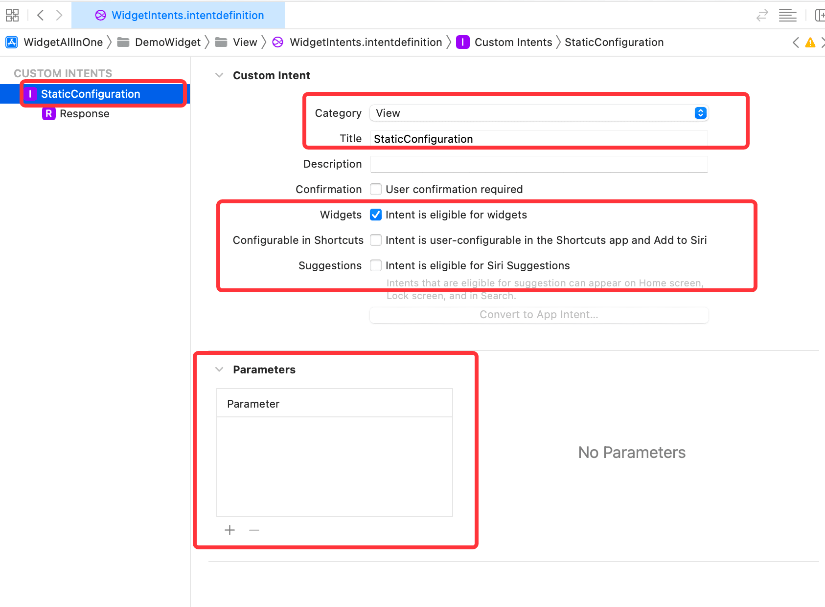
After clicking New Intent, pay attention to several aspects:
- The name of the Intent needs to be modified, as it defaults to
Intent, and there may be more than oneIntentfile in the project, so the naming needs to be changed. When modifying the name, note that when used in the project,Intentwill automatically be added to the modified name, for example, if modified toXXX, the name used in the project will beXXXIntent, so be careful not to repeat. - Then change the Intent's
CategorytoView. The other types can be tried one by one if interested. Thetitlebelow should also be changed to the name of the file. - Then check the options below. By default,
Configurable in ShortcutsandSuggestionsare checked. Here, uncheck these two and checkWidgets, which is easy to understand. The more options you check, the more settings you need to make, so at the beginning, just checkingWidgetsis enough. After getting familiar with it, if you want to setSiri suggestionsorShortcuts, you can check the other two options later.
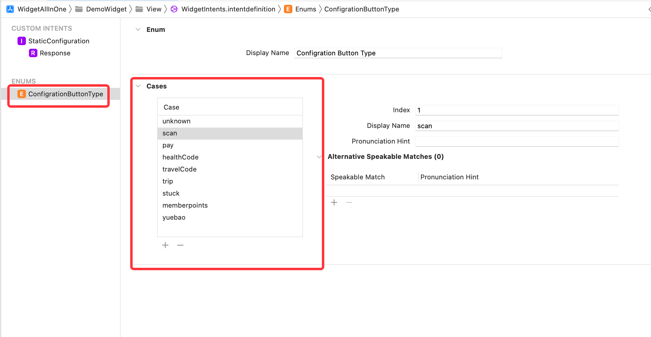
Then click the + in the lower left corner again to add a new Enum. Note that the class name of the Enum cannot be the same as the name of the Enum in the project. The Enum is used for selection, so when clicking to edit the widget, it will be selected. The contents of the Enum should be defined according to the actual situation. The display name of the added case can be in Chinese, which is consistent with the contents of ButtonType in the project, as shown in the figure below.
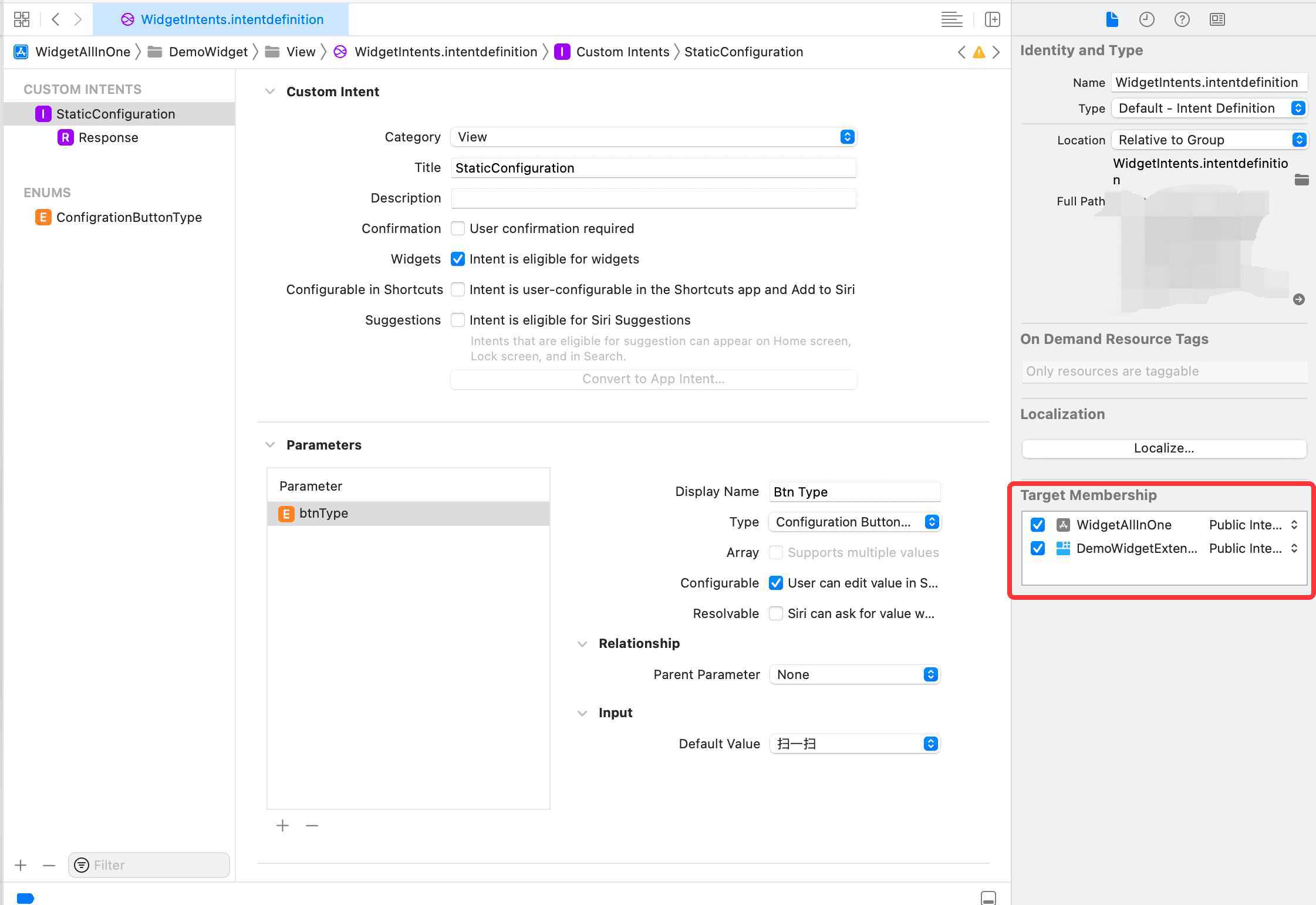
After adding the Enum, click the previously created StaticConfiguration, and in the Parameter section, click to add a new one, naming it btnType, changing the Type to the created Enum type, and unchecking Resolvable, as shown:

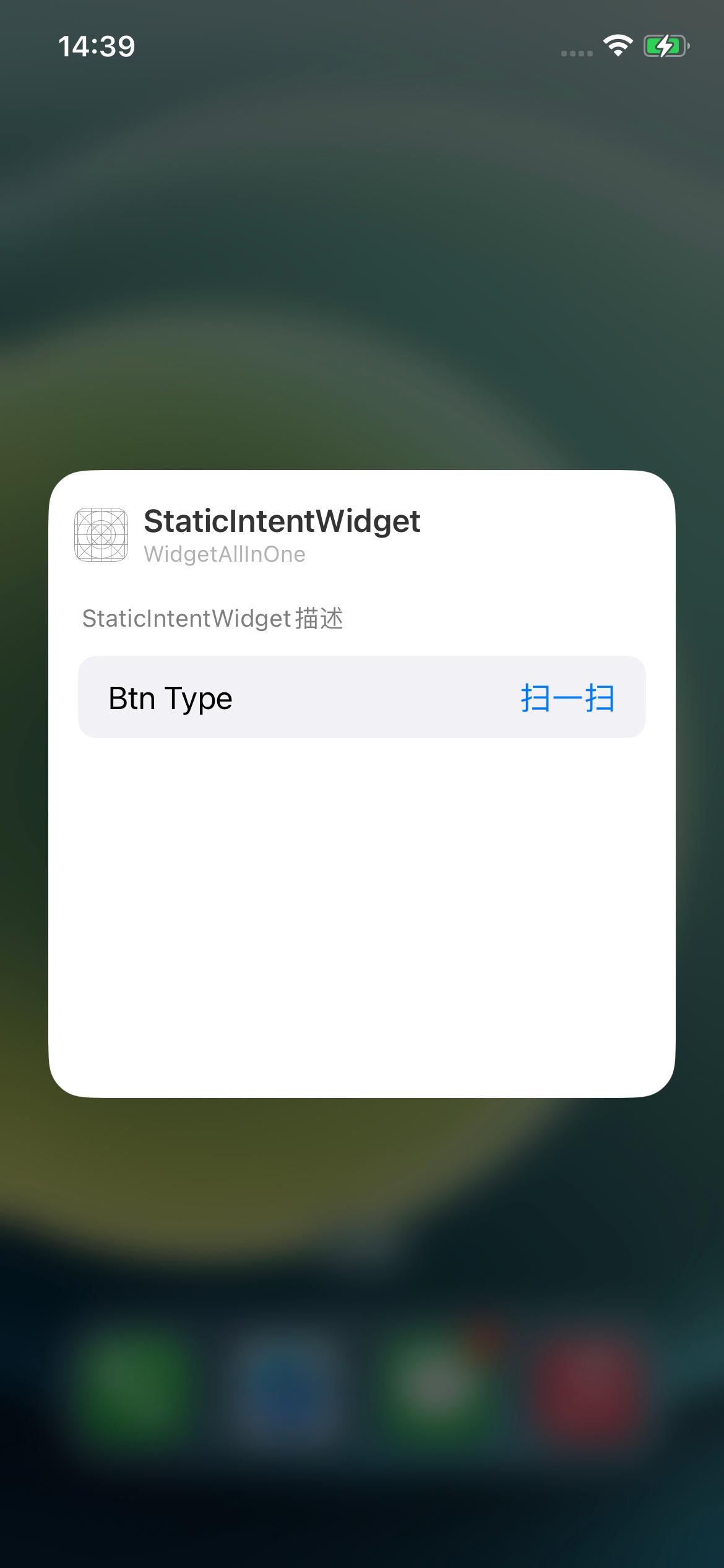
Now that the Intent has been added, run it and check the effect. You will find that the Edit Widget entry still does not appear. Why?
Although the Intent has been created, there is no widget using the Intent, so a new widget using the Intent needs to be added. The steps are as follows:
Create a new StaticIntentWidgetProvider class, with the following code:
import Foundation
import WidgetKit
import SwiftUI

struct StaticIntentWidgetProvider: IntentTimelineProvider {

    typealias Entry = StaticIntentWidgetEntry
    typealias Intent = StaticConfigurationIntent

    // Convert the button type defined in the Intent to the button type used in the Widget
    func buttonType(from configuration: Intent) -> ButtonType {
        switch configuration.btnType {
        case .scan:
            return .scan
        case .pay:
            return .pay
        case .healthCode:
            return .healthCode
        case .travelCode:
            return .travelCode
        case .trip:
            return .trip
        case .stuck:
            return .stuck
        case .memberpoints:
            return .memberpoints
        case .yuebao:
            return .yuebao
        case .unknown:
            return .unknown
        }
    }

    func placeholder(in context: Context) -> StaticIntentWidgetEntry {
        StaticIntentWidgetEntry(date: Date())
    }

    func getSnapshot(for configuration: StaticConfigurationIntent, in context: Context, completion: @escaping (StaticIntentWidgetEntry) -> Void) {
        let buttonType = buttonType(from: configuration)

        let entry = StaticIntentWidgetEntry(date: Date())
        completion(entry)
    }

    func getTimeline(for configuration: StaticConfigurationIntent, in context: Context, completion: @escaping (Timeline<StaticIntentWidgetEntry>) -> Void) {
        let entry = StaticIntentWidgetEntry(date: Date())
        // refresh the data every two hours
        let expireDate = Calendar.current.date(byAdding: .hour, value: 2, to: Date()) ?? Date()
        let timeline = Timeline(entries: [entry], policy: .after(expireDate))
        completion(timeline)
    }
}

struct StaticIntentWidgetEntry: TimelineEntry {
    let date: Date

}

struct StaticIntentWidgetEntryView: View {
    var entry: StaticIntentWidgetProvider.Entry
    let mediumItem = AliPayWidgetMediumItem()

    var body: some View {
        AlipayWidgetMeidumView(mediumItem: mediumItem)
    }
}

struct StaticIntentWidget: Widget {

    let kind: String = "StaticIntentWidget"

    var title: String = "StaticIntentWidget"
    var desc: String = "Description of StaticIntentWidget"

    var body: some WidgetConfiguration {
        IntentConfiguration(kind: kind,
                            intent: StaticConfigurationIntent.self,
                            provider: StaticIntentWidgetProvider()) { entry in
            StaticIntentWidgetEntryView(entry: entry)
        }
        .configurationDisplayName(title)
        .description(desc)
        .supportedFamilies([.systemMedium])
    }
}
Add it to the WidgetBundle as follows:
import SwiftUI
import WidgetKit

@main
struct WidgetBundleDemo: WidgetBundle {
    @WidgetBundleBuilder
    var body: some Widget {
        StaticIntentWidget()
    }
}
Run and check the effect as follows:

Note:
If after running, the Edit Widget appears, but the editing interface is empty and does not display the images from steps two and three above, you can check whether the Intent is checked for the main project, as shown below:
Dynamic Intent Configuration#
Continuing to compare with the Alipay Widget, you can see that the style of the Static Intent Configuration implemented above is different from that of Alipay. Alipay displays multiple options, and the style of each selected option is also different from the one implemented above. So how is this achieved?
The answer is Dynamic Intent Configuration, let's continue:
Select the Intent and click to add New Intent, name it DynamicConfiguration, change the Category to View, check Widgets, and uncheck Configurable in Shortcuts and Suggestions, as shown:

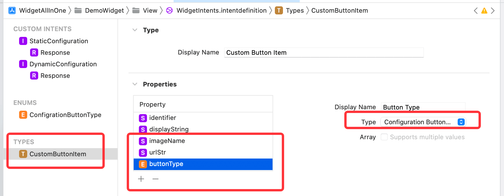
Next, click to add New Type, name it CustomButtonItem, which will be used when adding Parameter in DynamicConfiguration. In Properties, add urlStr and imageName properties of type String, and then add a buttonType property of the defined Enum type — ConfigrationButtonType, as shown:
Then, add Parameter to DynamicConfiguration, select Type as CustomButtonItem, check Supports multiple values, Fixed Size, Dynamic Options, uncheck Resolvable, and enter the text Please Select in the Prompt Label under Dynamic Options. The Fixed Size can be modified for different styles. As shown:

At this point, the settings in the Intent are complete. However, there is still a question: although Supports multiple values is checked in the Intent, where does the data come from? Where do the default displayed data come from when clicking to edit the widget? Where does all the data come from when clicking a single button?
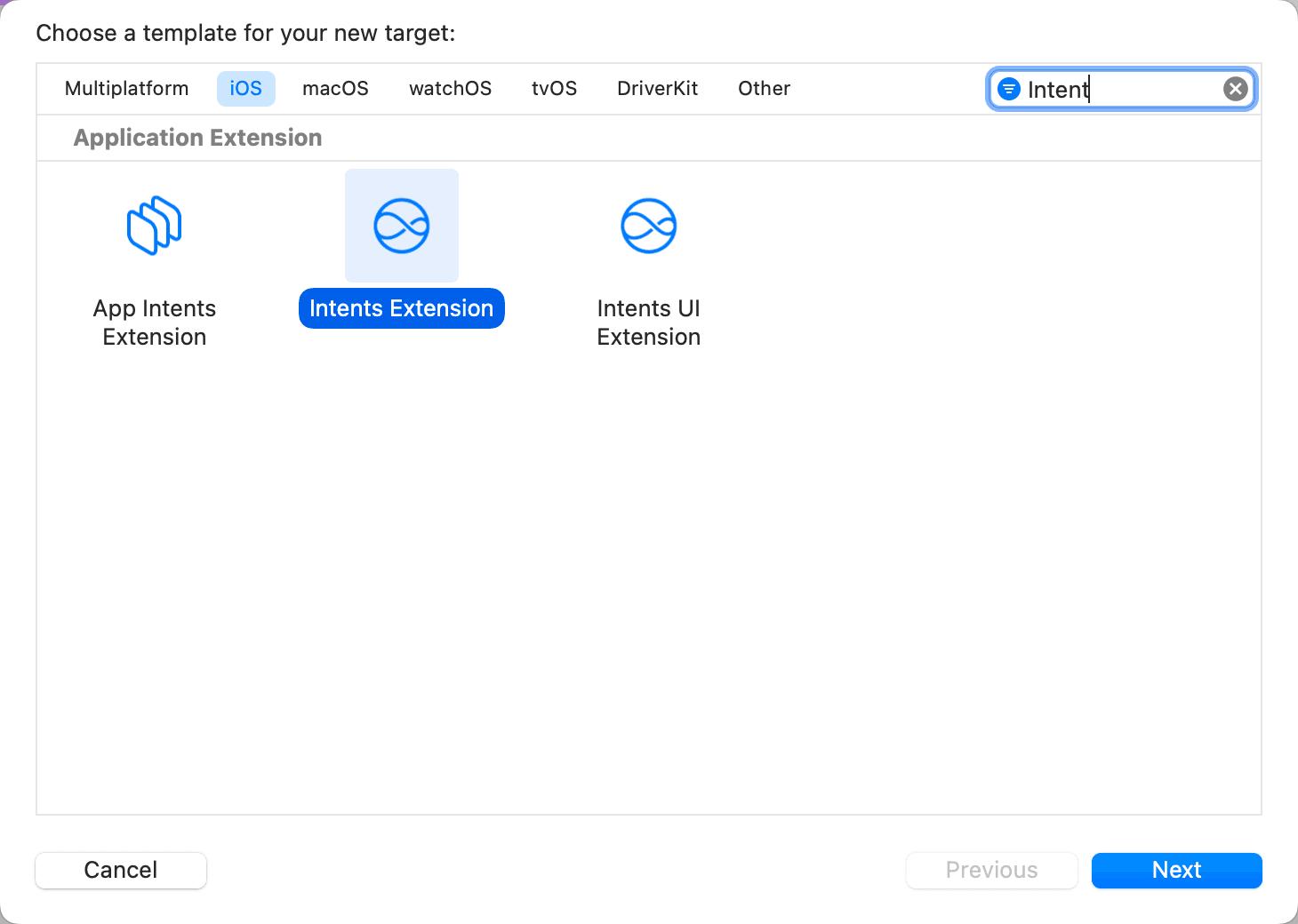
The answer is Intent Extension. Click File -> New -> Target. Note that this is a Target, search for Intent, and select Intent Extension, as shown, then click next, uncheck Includes UI Extension, and click finish, as shown:

Then, select the .intentdefinition file, and check the newly created Target in Target MemberShip, as shown below:

Next, select the project, select the WidgetIntentExtension Target, change the Deployment Info to 15.0, and in Supported Intents, click +, then enter DynamicConfigurationIntent, as shown:

Since the Intent Extension needs to use ButtonType from the Widget, select the class where ButtonType is located and check the Intent Extension Target in Target MemberShip, as shown below:
Then select IntentHandler, which is where the data source is located, and modify the content as follows:
import Intents

class IntentHandler: INExtension {

    override func handler(for intent: INIntent) -> Any {
        // This is the default implementation.  If you want different objects to handle different intents,
        // you can override this and return the handler you want for that particular intent.

        return self
    }

}

extension IntentHandler: DynamicConfigurationIntentHandling {
    func provideSelectButtonsOptionsCollection(for intent: DynamicConfigurationIntent, searchTerm: String?, with completion: @escaping (INObjectCollection<CustomButtonItem>?, Error?) -> Void) {
        let typeList: [ConfigrationButtonType] = [.scan, .pay, .healthCode, .trip, .travelCode, .stuck, .memberpoints, .yuebao]
        let itemList = generateItemList(from: typeList)
        completion(INObjectCollection(items: itemList), nil)
    }

    func defaultSelectButtons(for intent: DynamicConfigurationIntent) -> [CustomButtonItem]? {
        let defaultBtnTypeList: [ConfigrationButtonType] = [.scan, .pay, .healthCode, .trip]
        let defaultItemList = generateItemList(from: defaultBtnTypeList)
        return defaultItemList
    }

    fileprivate func generateItemList(from typeList: [ConfigrationButtonType]) -> [CustomButtonItem] {
        let defaultItemList = typeList.map({
            let formatBtnType = buttonType(from: $0)
            let item = CustomButtonItem(identifier: formatBtnType.id,
                                        display: formatBtnType.displayName)
            item.buttonType = $0
            item.urlStr = formatBtnType.urlStr
            item.imageName = formatBtnType.imageName
            return item
        })
        return defaultItemList
    }

    // Convert the button type defined in the Intent to the button type used in the Widget
    func buttonType(from configurationType: ConfigrationButtonType) -> ButtonType {
        switch configurationType {
        case .scan:
            return .scan
        case .pay:
            return .pay
        case .healthCode:
            return .healthCode
        case .travelCode:
            return .travelCode
        case .trip:
            return .trip
        case .stuck:
            return .stuck
        case .memberpoints:
            return .memberpoints
        case .yuebao:
            return .yuebao
        case .unknown:
            return .unknown
        }
    }
}
Finally, create a new IntentTimelineProvider to display this effect, with the following code:
import Foundation
import WidgetKit
import SwiftUI

struct DynamicIntentWidgetProvider: IntentTimelineProvider {
    typealias Entry = DynamicIntentWidgetEntry
    typealias Intent = DynamicConfigurationIntent

    func placeholder(in context: Context) -> DynamicIntentWidgetEntry {
        DynamicIntentWidgetEntry(date: Date())
    }

    func getSnapshot(for configuration: DynamicConfigurationIntent, in context: Context, completion: @escaping (DynamicIntentWidgetEntry) -> Void) {
        let entry = DynamicIntentWidgetEntry(date: Date(), groupBtns: configuration.selectButtons)
        completion(entry)
    }

    func getTimeline(for configuration: DynamicConfigurationIntent, in context: Context, completion: @escaping (Timeline<DynamicIntentWidgetEntry>) -> Void) {
        let entry = DynamicIntentWidgetEntry(date: Date(), groupBtns: configuration.selectButtons)
        let expireDate = Calendar.current.date(byAdding: .hour, value: 1, to: Date()) ?? Date()
        let timeline = Timeline(entries: [entry], policy: .after(expireDate))
        completion(timeline)
    }
}


struct DynamicIntentWidgetEntry: TimelineEntry {
    let date: Date
    var groupBtns: [CustomButtonItem]?
}

struct DynamicIntentWidgetEntryView: View {
    var entry: DynamicIntentWidgetProvider.Entry

    var body: some View {
        AlipayWidgetMeidumView(mediumItem: AliPayWidgetMediumItem(with: entry.groupBtns))
    }
}

struct DynamicIntentWidget: Widget {

    let kind: String = "DynamicIntentWidget"

    var title: String = "DynamicIntentWidget"
    var desc: String = "Description of DynamicIntentWidget"

    var body: some WidgetConfiguration {
        IntentConfiguration(kind: kind,
                            intent: DynamicConfigurationIntent.self,
                            provider: DynamicIntentWidgetProvider()) { entry in
            DynamicIntentWidgetEntryView(entry: entry)
        }
        .configurationDisplayName(title)
        .description(desc)
        .supportedFamilies([.systemMedium])
    }
}
The effect is as follows:

At this point, we are almost done. Comparing with the Alipay widget, we can see that there are still styles for displaying weather and selecting function position. In the DynamicConfiguration's Parameter, directly add two properties: selecting function position as an Enum type and displaying weather as a Bool type. Then adjust the position, moving the selectButtons property to the bottom. The detailed steps can be tried by everyone.
The final effect is as follows:

Summary:#

The complete project code has been placed on github: https://github.com/mokong/WidgetAllInOne
Supplement:
If you want to refresh the widget, the default refresh timing of the widget is based on the timeline settings. However, if you want to force a refresh, for example, after an operation in the APP changes the state and you want the widget to refresh, you can use the following code, just call it where the refresh is triggered:
import WidgetKit

@objc
class WPSWidgetCenter: NSObject {
    @available(iOS 14, *)
    static func reloadTimelines(_ kind: String) {
        WidgetCenter.shared.reloadTimelines(ofKind: kind)
    }

    @available(iOS 14, *)
    @objc static func reloadAllTimelines() {
        WidgetCenter.shared.reloadAllTimelines()
    }
}